
In 2025, logo debates have escaped design Twitter and landed firmly in the mainstream. From the Royal Institute of British Architects’ crisp new red wordmark to the refreshed GOV.UK identity and a string of contentious automotive and retail overhauls, everyone suddenly has an opinion on kerning, colour and “moving a dot”. Yet the real battleground for these identities is not letterheads or building signage. It is a crowded grid of icons on a mobile home screen and a stream of thumbnails in social feeds.
The context has shifted dramatically. Ofcom’s Online Nation 2024 data shows that UK adults now spend an average of 4 hours and 20 minutes online every day, up from 3 hours and 41 minutes in 2023. This marks a sharp jump in just twelve months and reflects a deeper dependence on digital environments for work, news and entertainment. At the same time, the IPA’s TouchPoints survey reports that people in Great Britain now spend more time on their mobiles than watching TV, 3 hours and 21 minutes on phones compared with 3 hours and 16 minutes on television, with total screen time across devices reaching around 7.5 hours a day. If brands are experienced primarily as pixels, then composition at tiny sizes becomes a strategic issue, not a finishing touch.
The most high-profile rebrands of the year are, in effect, live experiments in how far you can push a logo and still have it read clearly at the size of a notification badge. For designers, the lesson is less about taste and more about survival: what actually remains of your carefully crafted identity at 64 by 64 pixels?
Key point
The rebrand conversation in 2025 is really a screen-size conversation. Logos are being judged in feeds and app grids first, print and signage second.
Rebrands designed for feeds, not letterheads
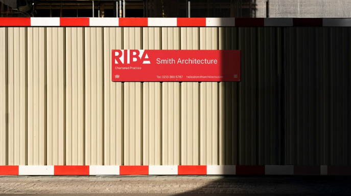
RIBA’s new identity, developed with Johnson Banks, is a textbook example of designing a heritage mark for digital life. The organisation has shifted from a serif wordmark to a bold sans-serif uppercase logo that leans heavily on its historic red, while its ornate crest has been simplified into a quieter sign-off. The move is not just aesthetic. A short, blocky wordmark in a high-contrast colour will simply survive better in a sea of favicons and small header locks than a delicate logotype with fine hairlines.
Something similar is happening with the refreshed GOV.UK brand. Government Digital Service has been at pains to explain that this is a “refresh, not a rebrand”, but the public narrative has fixated on the small turquoise dot between “gov” and “uk” and the cost of the work. Stripped of context, before-and-after screenshots surface in feeds as meme material. Yet from a composition perspective, the design team is tightening a system so that a modest wordmark can remain legible across headers, favicons and app tiles, while colour and layout carry more of the hierarchy.
The backlash to Jaguar’s recent identity experiment shows the other side of this coin. A lavish, fashion-led campaign that de-emphasised the familiar leaping-cat icon in favour of abstract imagery and bold colour was widely criticised as being disconnected from the brand’s engineering heritage, and the creative chief behind the shift has since departed. Whether one likes the work or not, it underlines the risk: when a logo is cropped down to a social avatar, anything that dilutes recognisable shape and contrast can feel like a break in trust.
For designers, the practical implication is clear. Identity work must be tested on the same canvas where audiences actually see it: notification bars, profile chips, micro-avatars in chat interfaces, and newsletter headers in dark mode. Composition that looks balanced on a presentation slide can fall apart when the logo is forced into a circular mask or squeezed into the corner of a responsive card component.
Key point
Every major rebrand in 2025 is being judged on screenshots. If you are not designing and testing within real UI environments, you are only doing half the job.
What survives at 64 by 64 pixels?
A useful way to think about modern logo design is to start from the smallest size and scale up, rather than the other way around. Many interface elements still render brand marks at around 64 by 64 pixels, and some browser favicons and toolbar icons go down to 32 by 32. At those scales, several things happen: fine serifs and inline details blur, subtle gradients flatten, long wordmarks collapse into mush, and any tagline or descriptive text becomes illegible.
From a cognitive point of view, the brain is working with a handful of cues: silhouette, internal negative space, and one or two key colour relationships. High-contrast shapes, distinctive letterforms and strong figure–ground relationships are more likely to be recognised quickly. This is why so many recent wordmarks are moving towards simple geometric structures and large counters, even at the risk of being accused of “blanding”. It is not that nuance has disappeared, it has simply migrated into motion, photography and tone of voice, where there are more pixels to play with.
There is also a statistical backdrop to this focus on tiny icons. Ofcom figures show that around 94 per cent of UK adults now have home internet access, with the vast majority going online via smartphones at least some of the time. When almost everyone is connected, and most of that attention flows through small screens, the brand that wins the “thumbnail war” often wins recall. In that landscape, a small improvement in legibility or shape recognition at icon size can have outsized effects on click-through and dwell time, because it nudges people to recognise and trust your mark a split second faster.
For design teams, this means putting tiny canvases at the centre of the process. It is common now to build a Figma or Sketch page filled with simulated app tiles, avatar circles and notification badges, and to paste proposed marks into these slots as early as the concept stage. Rather than asking “does this feel premium?”, the more useful question becomes “can I still read this when it is competing with fifteen other icons in my peripheral vision?”.
Key point
At icon sizes, logos stop being stories and start being shapes. Silhouette, contrast and negative space do more work than detail, narrative or clever typography.
Reframing, not reinventing, the mark
One of the more encouraging lessons from 2025’s logo wars is that you often do not need a total overhaul. Many marks can be made dramatically more effective in digital contexts by changing how they are framed, not what they depict. This is especially true for institutions and SMEs with strong local equity in their existing symbols, where radical change risks alienating loyal audiences.
A classic scenario is the long, horizontal logo that was designed for signage or stationery. In a masthead or on a shopfront, a wide lock-up with a crest and a strapline can feel authoritative. In a square avatar, it turns into a row of illegible fragments. One solution is to create a secondary, constrained version of the mark that zooms into the most recognisable element: the initial letter, the crest, or an abstract form that already exists within the logo. By enclosing this in a consistent container, you preserve recognition while giving the system a robust square or circular “stamp” for digital use.
This is where practical experimentation matters more than principle. Rather than debating theory, a designer can drop the source logo into an image cropper and try multiple framings: loose crops that show the full wordmark with generous breathing room, tighter crops that zoom into one character, and extreme crops that treat a detail as an abstract icon. Comparing these side by side at small sizes often reveals surprising winners. Sometimes a crop that feels almost too tight at full size becomes the strongest mark in a feed.
Cropping is not only about what you show. It is also about what you are willing to hide. Many brands resist removing secondary elements such as taglines or accreditation marks, even when they contribute nothing at small sizes. Creating clear rules about when those elements appear, and when they disappear, is part of composition in the digital era. Designers need to articulate a hierarchy: which symbol is the hero for tiny avatars, which lock-up is used for larger panels, and where more information is allowed to surface.
Key point
You can often protect heritage and improve performance by reframing existing marks for different sizes, instead of throwing away a logo that already works in other contexts.
Practical composition drills for client assets
Rebrands rarely happen in a vacuum. Most design teams are working with archives of photography, illustration and legacy logos that clients want to reuse across new interfaces. The question becomes how to repurpose these assets so they survive in tight UI components without feeling clumsy or cropped at random.
A simple first step is to create a set of standard aspect ratios that map directly to common containers: one-to-one for avatars, four-to-three for cards, sixteen-to-nine for hero banners and so on. For each important logo or hero image, designers can generate a “family” of crops in those ratios. Using an image cropper in a browser or design tool, you can systematically drag the frame to test different focal points instead of eyeballing crops ad hoc for each platform.
Once you have a bank of crops, it becomes easier to define safe margins. Many interfaces add their own chrome, such as rounded masks, subtle borders, or overlay icons that indicate video, live status or verified accounts. The goal is to keep crucial information away from those zones. A practical rule of thumb is to imagine a buffer inside the edge of your crop, perhaps 10 to 15 per cent of the width, where no key text or symbol is allowed to sit. That way, when the platform applies its own styling, the logo or illustration still feels centred and intact.
Beyond logos, the same logic applies to complex hero images. If a client insists on using a busy group photograph or architectural shot as a banner, the designer can try multiple crops that emphasise different subjects: a detail of a façade, a close-up of a face, or a composition that uses negative space to leave room for overlay text. Running these variations through a quick image cropper pass and then viewing them on real devices alongside UI elements such as buttons and menus is often more revealing than any guidelines document.
To make this process repeatable, it can help to formalise a few simple drills in your studio workflow:
- Test every logo concept in at least three square crops: generous, medium and tight.
- Generate avatar and card crops for hero imagery at the same time as selecting the final shot.
- Check all assets in both light and dark mode, as contrast and perceived weight will shift.
- Review the full system on phones, not just on large desktop screens.
Key point
Treat cropping and safe-margin testing as a structured part of the design process. Systematic drills produce more reliable results than one-off “good eye” decisions.
What this means for designers now
Underneath the noisy discourse about “woke rebrands” and expensive dots, there is a quieter shift in practice. Identity work is becoming less about monumentality and more about agility. The brands that feel coherent in 2025 are those that accept the reality of life at icon size, then build composition rules that scale gracefully upwards from there.
For UK designers, this means embracing a more empirical mindset. When adults are spending upwards of four hours online every day, much of it on mobile devices, your logo is less a static badge and more a recurring pattern in a constantly shifting interface. Measuring what survives at 64 by 64 pixels, tracking how framing affects click-through in newsletters, and treating crops as deliberate design moves rather than production afterthoughts are all part of the craft.
None of this diminishes the importance of story, symbolism or typographic finesse. Rather, it asks those qualities to operate within stricter constraints. A strong concept still matters, but it needs a clear, legible shape that can live comfortably inside app icons, feed cards and UI components without losing its character. The work of 2025’s most visible rebrands suggests that the winners in this “logo war” will be the teams that obsess over composition as much as concept, and who are willing to iterate relentlessly on tiny thumbnails before they celebrate big unveilings.
Key point
The next wave of memorable identities will belong to designers who can think like interface architects as well as brand storytellers, making composition decisions that hold up from thumbnail to hoarding.
FAQs
How small should I test my logo during a rebrand?
As a baseline, always test at 64 by 64 pixels, and if your brand will appear in browser tabs or toolbar icons, go down to 32 by 32 pixels. If it is still recognisable there, it will cope well in most interfaces.
Do I always need a separate “avatar version” of a logo?
Not always, but it is often helpful. A simplified or cropped variant built from existing elements lets you protect legibility in tight spaces without changing the core identity everywhere else.
What makes a logo readable in a tiny app icon?
Strong silhouette, clear negative space and high contrast between figure and background. Fine details, gradients and long straplines tend to disappear or turn into visual noise at small sizes.
How can I stop social platforms cutting off parts of my logo?
Define internal safe margins and keep any crucial text or symbols away from the outer 10–15 per cent of your canvas. That buffer helps protect against circular masks, rounded corners and overlay icons.
Is it worth revisiting old client assets instead of starting from scratch?
Yes. Many existing logos and images can perform well with better framing and consistent aspect ratios. Reframing heritage marks is often more efficient and less risky than a full redesign.


