

White subway tile has survived over a century of design trends, and honestly, it shows no signs of slowing down. Every kitchen renovation conversation eventually circles back to it. But here’s the thing: choosing subway tile is rarely the hard part. Styling it so it feels deliberate, genuinely modern, and custom rather than straight off a builder’s truck? That’s where most people get stuck.
This guide walks through every decision that separates a polished kitchen from one that just happened to get tile: layout orientation, grout color, finish, height, edge trim, hardware pairings, and counter styling. Work through each of these with intention, and the result doesn’t need to announce itself, it just quietly looks expensive.
There’s also a practical reason to take this seriously. According to the National Association of Realtors, kitchen upgrades received a perfect Joy Score of 10, ranking them among the highest-satisfaction remodeling projects homeowners undertake.
When you’re investing real time and money into a kitchen upgrade, the backsplash is one of the most visible surfaces in your daily life. It deserves more than a five-minute showroom decision.
So let’s get into it, starting with the core formula that separates a white subway tile backsplash that looks custom from one that reads like a rushed renovation flip.
Modern Backsplash Ideas That Make White Subway Tile Look Custom, Not Basic
Here’s something worth saying plainly: getting subway tiles to look modern isn’t about finding the trendiest product. It’s about making a series of connected, deliberate choices that add up to something cohesive.
The backsplash ideas that consistently work share a few common traits, restraint, intention, and visual cohesion. None of these cost more. They just require more thought.
The Modern Formula: Fewer Visual Breaks, Cleaner Lines
Use large, uninterrupted visual fields wherever the layout allows, full-height runs, long stretches behind open shelves or the range wall. Where possible, align grout lines to architectural focal points like the hood centerline or cabinet edges.
And this is probably the most important rule of all: pick one “hero” decision. Either a bold layout pattern, or a strong grout contrast, or an interesting tile texture. Running all three at full volume simultaneously turns a kitchen into visual noise rather than a design statement.
Common Mistakes That Date a White Subway Tile Kitchen
You’ve seen this combination before, small 3×6 tiles everywhere, bright white grout, a short four-inch backsplash strip, and a busy countertop competing for attention. That’s the 2010s renovation flip formula, and somehow it’s still alive in kitchens being installed today. Once you can spot it, you can’t unsee it.
Too many competing hardware finishes compound the problem. Chrome, brass, and matte black all fighting each other, mixed with mismatched wood tones, makes the backsplash feel accidental. One or two dominant finishes, chosen deliberately, do far more for the overall room.
Subway Tile Styling Ideas by Finish: Gloss, Matte, and Handmade-Look
Finishing is one of the strongest levers you have in this whole decision process, and most people treat it like an afterthought. It shouldn’t be. The right surface quality matched to the right kitchen personality makes a significant difference.
Glossy Tile for Crisp, Reflective Kitchens
Glossy white subway tile backsplash works beautifully alongside flat-panel cabinets, minimal upper cabinetry, and slab or subtle-vein counters. The reflective surface creates natural movement as daylight shifts, so you don’t need pattern or color drama when the light itself is doing the work. Keep decor intentionally simple and let the tile breathe.
Matte and Velvet Finishes for Warmer, Design-Forward Spaces
If your kitchen leans warmer, or if you’re dealing with glare from strong overhead LEDs, matte and velvet finishes will serve you far better than gloss. Matte pairs naturally with warm woods, microcement-look countertops, and greige or cream palettes; it reads softer, quieter, and genuinely sophisticated.
Handmade and Zellige-Look Formats for Texture Without the Farmhouse Feel
Handmade and zellige-style subway tiles sit in an interesting middle ground, more personality than standard matte, but still restrained enough to stay contemporary when handled correctly.
The key is pairing them with modern hardware shapes like linear pulls and keeping grout contrast subtle. That combination keeps the result feeling current rather than sliding into farmhouse territory.
Layout Upgrades That Go Beyond Classic Running Bond
Layout is genuinely where the styling happens. The same tile can look like two completely different kitchens depending on how it’s oriented, what format you choose, and where you position the pattern.
Vertical Stack for an Architectural Quality
Vertical stacking gives any kitchen an immediate lift, literally. It visually raises ceiling height, which makes it especially effective in smaller spaces.
When grout lines align with cabinet edges or the hood centerline, the result has an architectural quality that standard running bonds simply can’t replicate.
Straight Grid for Pure Minimalism
If your design goal is uninterrupted calm, the straight grid layout takes that intention to its logical conclusion, particularly when you use longer tile formats like 2×10 or 3×12. Match grout color close to the tile for a near-seamless “sheet of tile” effect that reads as one unified, quiet surface.
Herringbone as a Strategic Feature Zone
There’s a difference between herringbone used thoughtfully and herringbone used everywhere. Behind the range or sink wall, a well-executed herringbone creates just enough visual interest to anchor the space as a focal point, without turning the entire kitchen into a pattern exercise.
Keep surrounding walls in stacked or running bond, and opt for a larger scale herringbone for a modern rather than traditional feel.
Oversized Subway Formats: The “New Classic” Move
Sometimes you don’t need a dramatic pattern at all. Elongated subway formats, 2×16 or 4×16 rectangles, read significantly more modern than classic 3×6 tiles, largely because fewer grout joints produce a cleaner, higher-end appearance. The scale does the work so the pattern doesn’t have to.
Where Each Layout Actually Belongs
Behind the hood: herringbone or vertical stack creates energy and focal pull. The sink wall and perimeter runs: stacked or simple running bond keeps things calm. And a hard rule worth following, one dominant pattern, everything else as an accent.
Grout Color and Joint Size That Can Make or Break the Whole Look
According to the NKBA’s 2026 Kitchen Trends Report, 60% of kitchen and bath professionals plan to incorporate statement colors in the backsplash going forward, making intentional detail choices more critical than ever. Grout is squarely part of that equation.
White Grout for a Seamless, Minimal Result
White grout is the right call when counters are bold or cabinets are colored, it keeps the backsplash from competing. Keep joint width narrow, between 1/16″ and 1/8″, for a clean modern result. Wide joints with white grout? That’s a combination that ages quickly.
Light Gray for Depth With a Maintenance Advantage
Light gray grout adds just enough definition to create dimension, with the added practical benefit of being far more forgiving in daily use.
It works especially well when the soft gray tone echoes vein colors in quartz or marble-look countertops, a quiet design connection that reads as intentional without being obvious.
Charcoal and Black Grout for a Graphic Statement
Dark grout isn’t subtle, and it’s not meant to be. When executed well, charcoal or black grout transforms a white subway tile kitchen into one of the most graphic, contemporary results possible.
One honest caveat though: high contrast highlights imperfect cuts and lippage more than anything else. If you’re going dark, installer quality is non-negotiable.
Grout Formulation Matters As Much as Color
In cooking zones where grease and steam are constant, stain-resistant or epoxy-blend grout isn’t optional, it’s just the right call.
White grout requires more maintenance honesty than most people expect. Light-to-medium grays offer the best practical balance for the majority of kitchens.
Countertop, Cabinet, and Hardware Pairings That Complete the Look
With layout and grout sorted, it’s time to zoom out. How your tile interacts with the rest of the kitchen is what determines whether the overall design feels considered or accidental.
White Tile With White Counters
An all-white kitchen can absolutely feel intentional rather than sterile, but you need warmth introduced somewhere.
Wood tones, brushed metals, or a handmade-look tile finish all provide that necessary contrast. Under-cabinet lighting temperature matters here too: 2700K–3000K keeps the space from reading cold and clinical.
Pairing With Veined Quartz or Marble-Look Slabs
Stone slabs bring visual energy on their own. The backsplash needs to balance that, not compete with it. Choose grout that echoes the slab’s soft vein color, and lean toward simpler layouts when the countertop already has movement.
Cabinet Colors That Feel Current
Warm white or cream cabinets pair naturally with softer white tile and warm grout tones. Greige and taupe call for matte tile with light warm gray grout.
Deep green, navy, or charcoal cabinets balance well against glossy white tile with a subtle grout line. The pattern is simple: warm cabinet, warm tile; bold cabinet, clean restrained tile.
Hardware That Signals the Finish Line
Brushed nickel reads timeless. Matte black delivers graphic, contemporary contrast. Brushed brass brings warmth, just keep other metal finishes minimal or the whole effect unravels.
Hardware is the punctuation that tells you whether the kitchen is timeless modern, warm modern, or graphic contemporary.
Height, Edges, and Transitions, Where DIY Installs Get Exposed
Full-height coverage creates immediate visual impact. But that investment only pays off when every edge and termination is handled with the same care as the tile field itself. This is genuinely where designer kitchens separate themselves from competent-but-generic ones.
Full-Height for a Built-In, Architectural Feel
Counter to ceiling behind open shelves, hood walls, and the sink wall, fewer horizontal breaks make the kitchen feel larger, more architectural, and signal design intentionality rather than a standard upgrade package.
Clean Termination at Open Ends
Metal edge profiles are the right call for modern minimalism. Pencil and trim pieces suit transitional kitchens but should be used sparingly in strictly contemporary designs. Clean edges that don’t call attention to themselves are always the goal.
Outlets and Switches That Don’t Fragment the Install
Low-profile outlet covers aligned to grout lines wherever framing allows, in paint-matched or finish-coordinated materials, black or brass, reduce visual fragmentation. It’s a small detail that most people never consciously notice. They do notice when it’s wrong, though.
Corners and Window Returns
Mitered corners are the most modern solution, no trim, just a clean folded tile edge. Bullnose works in transitional kitchens. Whatever approach you choose, keep cuts symmetric at corners. That one detail alone signals whether the installation was finished or merely completed.
Styling the Finished Backsplash: Making It Live Well
The tile, grout, and installation are done. Now comes the layer that either reinforces all those good decisions or quietly undermines them.
The Three-Zone Counter Styling Approach
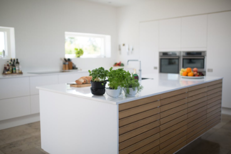
Cooking zone: minimal functional items in matching materials, an oil bottle, a salt board. Sink zone: one tray, one plant, one soap set in a unified finish. Coffee zone: a curated cluster with hidden cords and matched canisters. That’s the whole system. Structure first, then personality.
Color Accents That Work Against White Tile
Greens from potted herbs, warm wood tones, and black accents all work reliably against white subway tile. Limit yourself to two or three accent colors maximum. The tile should remain the visual anchor, not compete with everything sitting in front of it.
Open Shelving That Keeps the Tile Visible
Open shelves become a second stage with high visual stakes. Repeating shapes and materials, reduced label clutter, and intentional negative space keep the tile behind the shelf readable as part of the design rather than a hidden backdrop.
Lighting That Does Real Work
Under-cabinet LEDs in the 2700K–3000K range keep tile color accurate and warm. With glossy tile, angle the fixture or use a diffuser to prevent hotspot glare along long uninterrupted runs.
Frequently Asked Questions
Is white subway tile still in style for modern kitchens?
Completely. The tile itself isn’t the variable, how you style it is. Layout, finish, grout color, and height choices determine whether it reads timeless and custom or dated and generic.
What pairs well with white subway tile?
Crisp white cabinetry, warm wood tones, brushed metals, and veined quartz counters all work beautifully. Matte black hardware adds graphic contrast; soft greige palettes keep the space warm and grounded.
How do you achieve a high-end look on a budget?
Spend on installer quality and full-height areas first. An elongated tile format, intentional grout color, and clean edge profiles deliver genuinely high-end results without premium tile costs. When learning how to style a white subway tile backsplash on a tighter budget, those specific decisions create the most visible return. TileBar’s Manchester Bianco White 3×12 Glazed Ceramic Subway Tile, for example, delivers a polished result at an accessible price point.
Tiles That Sparkle Past Trends
White subway tile doesn’t need to be replaced to feel modern, it needs to be styled with genuine intention. Layout, finish, grout color, height, edge trim, and hardware cohesion are the real design decisions here.
Every one of them moves the result closer to “custom” or further toward “basic.” Get those details right, and what could have been a forgettable renovation choice becomes the quiet foundation of a kitchen you’ll actually love living in every day. The tile is timeless. The execution is everything.