
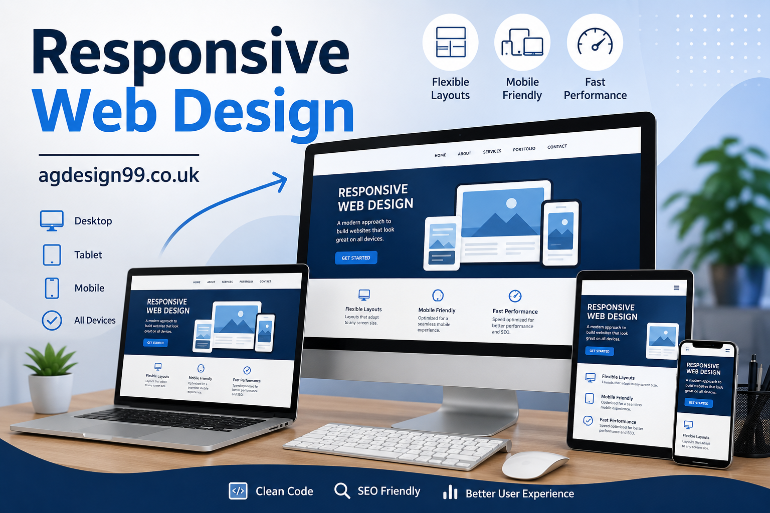
Responsive web design is a web development approach that allows a website to automatically adjust its layout, images, typography, and navigation according to the screen size and device being used.
Instead of creating separate desktop and mobile websites, developers build one flexible website that responds intelligently to different viewing environments.
The goal is simple: provide every visitor with the best possible browsing experience regardless of device.
Why Responsive Web Design Matters Today
People no longer browse the internet from a single type of device. Smartphones account for a large share of web traffic worldwide, while tablets, laptops, smart TVs, and foldable devices continue expanding the range of screen sizes.
When websites fail to adapt, visitors become frustrated.
Responsive websites help users:
- Read content comfortably
- Navigate menus easily
- Click buttons accurately
- Complete purchases faster
- Stay engaged longer
For businesses, that often translates into higher conversions and lower bounce rates.
How Responsive Web Design Works
Responsive websites combine several technologies to create flexible layouts.
These include:
Fluid Grid Layouts
Instead of fixed pixel widths, responsive layouts use relative units like percentages, allowing elements to expand or shrink depending on available space.
This creates natural flexibility across devices.
Flexible Images
Images automatically resize without becoming distorted or overflowing their containers.
Modern websites often use responsive image techniques to deliver different image sizes depending on the visitor’s screen.
CSS Media Queries
Media queries tell the browser when to apply different design rules.
For example:
- Mobile phones
- Tablets
- Small laptops
- Large desktop monitors
Each screen size receives styling that improves readability and usability.
Core Principles of Responsive Web Design
A successful responsive website follows several important principles.
Mobile-First Development
Rather than designing for desktop first, many developers begin with the smallest screens.
They then progressively enhance the layout for larger devices.
This approach often leads to cleaner designs and better performance.
Flexible Typography
Text should remain readable without forcing users to zoom.
Responsive typography adjusts font sizes, spacing, and line height according to screen dimensions.
Adaptive Navigation
Large desktop menus often become compact hamburger menus on smartphones.
Navigation remains simple without occupying excessive screen space.
Touch-Friendly Design
Mobile users rely on fingers instead of mouse pointers.
Buttons, links, and forms should provide enough spacing for comfortable tapping.
Benefits of Responsive Web Design
Responsive design delivers advantages for both visitors and website owners.
Better User Experience
Visitors appreciate websites that feel effortless to browse.
Easy navigation encourages longer sessions and more page views.
Improved SEO Performance
Search engines prioritize websites that offer excellent mobile experiences.
Responsive websites make crawling easier because only one version of each page exists.
This simplifies indexing while avoiding duplicate content issues.
Faster Website Management
Maintaining one responsive website is easier than managing separate desktop and mobile versions.
Content updates happen once instead of twice.
Higher Conversion Rates
Whether selling products or collecting leads, responsive websites reduce friction.
The easier users interact with your content, the more likely they are to complete desired actions.
Lower Development Costs
Although responsive design requires planning, maintaining one website generally costs less over time.
Responsive Web Design and SEO
Responsive web design directly supports search engine optimization.
Several ranking factors benefit from responsive websites.
Mobile Friendliness
Search engines evaluate how easily visitors use websites on mobile devices.
Responsive design helps satisfy these expectations.
Improved Core Web Vitals
Well-built responsive websites often achieve stronger scores in:
- Largest Contentful Paint
- Interaction responsiveness
- Layout stability
These metrics contribute to better user experience.
Lower Bounce Rates
When visitors enjoy browsing, they stay longer.
Longer engagement often signals content quality.
Better Crawl Efficiency
Search engines crawl one responsive website rather than separate mobile and desktop versions.
This simplifies indexing.
Essential Elements of Responsive Web Design
Several components work together to create successful responsive websites.
Flexible Containers
Content sections resize naturally without breaking layouts.
Responsive Images
Images scale while maintaining quality.
Scalable Videos
Embedded videos remain proportional across devices.
Readable Typography
Fonts maintain comfortable reading sizes regardless of screen width.
Responsive Forms
Input fields, buttons, and labels remain accessible on smaller screens.
Common Responsive Layout Patterns
Modern websites frequently use proven layout structures.
Single Column Layout
Ideal for smartphones.
Content flows vertically for easy scrolling.
Multi-Column Layout
Popular on desktops where additional screen space allows sidebars and extra content.
Card Layout
Cards organize products, articles, or services into flexible blocks that rearrange according to screen width.
Grid Layout
CSS Grid creates highly organized responsive layouts suitable for portfolios, galleries, and online stores.
Responsive Navigation Best Practices
Navigation deserves special attention because poor menus frustrate users quickly.
Good navigation should:
- Stay simple
- Remain easy to tap
- Avoid clutter
- Display important pages clearly
- Collapse gracefully on smaller devices
Consistency helps visitors find information faster.
Responsive Images Explained
Images often account for much of a webpage’s size.
Optimizing them improves both speed and user experience.
Useful techniques include:
- Modern image formats
- Compression
- Lazy loading
- Responsive image sizing
These methods reduce loading times without sacrificing visual quality.
Responsive Typography Matters More Than You Think
Large desktop text may overwhelm small screens.
Tiny fonts become unreadable on phones.
Responsive typography adjusts:
- Font size
- Line spacing
- Paragraph width
- Heading scale
Comfortable reading keeps visitors engaged.
Responsive Design for E-Commerce
Online stores depend heavily on responsive design.
Customers expect to:
- Browse products easily
- Zoom images smoothly
- Read reviews comfortably
- Complete checkout quickly
Poor mobile experiences often lead to abandoned carts.
Responsive Design for Blogs
Readers frequently discover blog posts through mobile search.
A responsive blog should feature:
- Clear headings
- Comfortable spacing
- Readable paragraphs
- Fast loading pages
- Simple navigation
These improvements encourage visitors to explore additional articles.
Responsive Design for Business Websites
Businesses build trust through professional websites.
Responsive design ensures:
- Contact information remains accessible
- Service pages display correctly
- Forms function properly
- Calls-to-action stay visible
These details influence customer confidence.
Common Responsive Web Design Mistakes
Even experienced developers occasionally overlook important details.
Common mistakes include:
Ignoring Mobile Testing
Testing only on desktop creates unexpected issues on smaller devices.
Oversized Images
Large image files slow page loading significantly.
Tiny Buttons
Buttons should remain easy to tap without accidental clicks.
Fixed Width Elements
Rigid layouts often break on smaller screens.
Too Much Content Above the Fold
Crowded interfaces overwhelm visitors.
Simple layouts perform better.
Responsive Web Design Tools
Many tools help developers create responsive websites.
Popular options include:
- Browser developer tools
- CSS Grid
- Flexbox
- Responsive frameworks
- Performance testing tools
- Mobile testing platforms
Using multiple tools improves development efficiency.
Responsive Design Best Practices
Following proven practices creates stronger websites.
Always:
- Design for mobile first
- Compress images
- Use flexible layouts
- Prioritize readability
- Optimize loading speed
- Test across multiple devices
- Simplify navigation
- Maintain accessibility
- Monitor website performance regularly
Accessibility and Responsive Design
Responsive websites should also remain accessible.
Good accessibility includes:
- Sufficient color contrast
- Keyboard navigation
- Screen reader compatibility
- Alternative image text
- Clear headings
- Logical content structure
Accessibility benefits everyone.
Future Trends in Responsive Web Design
Technology continues evolving.
Future responsive websites will increasingly support:
- Foldable devices
- Wearable screens
- Voice interactions
- AI-powered personalization
- Advanced CSS capabilities
- Faster web technologies
Design flexibility will remain more important than ever.
Conclusion
Responsive web design is no longer optional. It has become a standard expectation for modern websites. A responsive site improves user experience, supports better search visibility, simplifies maintenance, and increases the likelihood that visitors will stay, engage, and convert.
Whether you’re launching a personal blog, an online store, a company website, or a portfolio, investing in responsive web design creates lasting value. By focusing on flexible layouts, fast loading times, accessible navigation, and mobile-first thinking, you can build a website that serves users well today and remains ready for the devices of tomorrow.
Frequently Asked Questions
What is responsive web design?
Responsive web design is a method of creating websites that automatically adapt to different screen sizes, ensuring a consistent experience on phones, tablets, laptops, and desktop computers.
Why is responsive web design important?
It improves usability, supports better SEO, reduces maintenance costs, and helps visitors interact comfortably regardless of the device they use.
Does responsive web design improve Google rankings?
Responsive design supports mobile usability and user experience, both of which contribute positively to search performance when combined with quality content and good technical SEO.
What is the difference between responsive and adaptive design?
Responsive design uses flexible layouts that adjust continuously to screen sizes, while adaptive design relies on predefined layouts for specific devices.
Is responsive web design necessary for small business websites?
Yes. Small businesses benefit from responsive websites because customers increasingly search, browse, and contact businesses using mobile devices.
Read also: Home Decor Ideas Ththomedec That Make Every Room Feel Beautiful