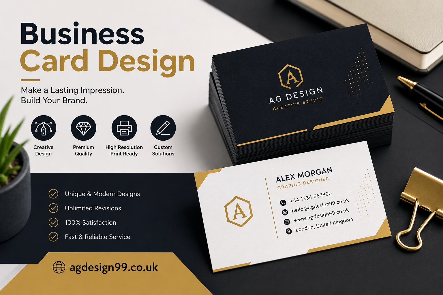
Business card design is more than choosing attractive colors or adding a company logo. It combines branding, readability, creativity, and functionality into a compact format that people can keep in their wallets, desks, or cardholders. When designed properly, a business card becomes an extension of your brand identity and a silent marketing tool that works long after a meeting ends.
Whether you are a freelancer, entrepreneur, consultant, creative professional, or business owner, understanding the principles of business card design can help you create a memorable first impression. This guide covers everything from layout and typography to printing techniques and current design trends.
Why Business Card Design Still Matters
Many people assume business cards have become outdated because of social media and digital networking platforms. However, they continue to play an important role in professional interactions.
Imagine attending a conference or meeting a potential client at an event. Instead of asking someone to search for your profile online, you hand them a beautifully designed card that instantly reflects your professionalism. That simple exchange often feels more personal and memorable.
Business cards also communicate credibility. A polished design suggests attention to detail, while a poorly designed or outdated card may unintentionally create a negative impression.
Benefits include:
- Creates a strong first impression
- Reinforces brand identity
- Makes networking easier
- Builds trust
- Acts as a portable marketing tool
- Encourages future contact
What Makes a Great Business Card Design?
The best business card designs balance creativity with clarity. Every element should have a purpose.
An effective card should immediately answer three questions:
- Who are you?
- What do you do?
- How can someone contact you?
Everything else supports those answers.
Essential Elements Every Business Card Should Include
A professional business card typically contains the following information:
Full Name
Your name should stand out more than any other text.
Job Title
Explain your professional role clearly.
Examples include:
- Graphic Designer
- Digital Marketing Consultant
- Financial Advisor
- Real Estate Agent
Company Name
Include your business name or brand prominently.
Logo
A high-quality logo increases recognition and strengthens branding.
Contact Information
Include only the methods people are most likely to use.
Typically this includes:
- Phone number
- Email address
- Website
- Office address if relevant
Social Media
If social platforms are part of your business, include only the important ones.
For example:
- Behance
- Dribbble
Understanding Business Card Layout
A clean layout makes information easier to scan.
Good layouts use visual hierarchy so readers naturally know where to look first.
An ideal reading order might be:
- Logo
- Name
- Job title
- Contact details
- Website
White space is equally important. Crowding every inch of the card makes it difficult to read.
Choosing the Right Colors
Colors influence perception more than many people realize.
Different colors communicate different emotions.
Blue
Represents trust, professionalism, and reliability.
Perfect for:
- Finance
- Healthcare
- Corporate businesses
Black
Elegant, luxurious, and premium.
Popular among:
- Luxury brands
- Fashion
- Consultants
Green
Represents growth, health, and sustainability.
Ideal for:
- Wellness
- Environmental companies
- Organic brands
Red
Bold and energetic.
Suitable for:
- Entertainment
- Food businesses
- Sales professionals
Typography Matters More Than You Think
Beautiful fonts mean little if they cannot be read easily.
A professional business card usually uses one or two font families.
Keep these guidelines in mind:
- Prioritize readability
- Avoid decorative fonts for body text
- Use larger font sizes for names
- Maintain consistent spacing
Simple typography often looks more expensive than overly artistic fonts.
Selecting High-Quality Images
Most business cards do not require photographs.
Instead, focus on:
- High-resolution logos
- Custom icons
- Brand graphics
- Clean illustrations
If using a personal photo, ensure it appears professional and matches your industry.
Standard Business Card Sizes
Different countries use different dimensions.
Common sizes include:
United States
3.5 × 2 inches
Europe
85 × 55 mm
Square Cards
Modern and creative but slightly less practical.
Mini Cards
Compact and unique.
Popular Business Card Materials
The material influences how your card feels.
Standard Matte Paper
Affordable and professional.
Gloss Finish
Bright colors with a polished appearance.
Textured Paper
Adds sophistication.
Kraft Paper
Excellent for eco-friendly brands.
Plastic Cards
Durable and modern.
Metal Cards
Luxury option for premium industries.
Single-Sided vs Double-Sided Business Cards
Double-sided designs provide extra space without overcrowding.
The front often contains:
- Logo
- Name
- Brand identity
The back may include:
- Contact information
- QR code
- Services
- Social media
Should You Add a QR Code?
Yes, when used thoughtfully.
A QR code can direct people to:
- Website
- Portfolio
- Online booking page
- Digital business card
- Product catalog
Avoid making the QR code too small.
Always test it before printing.
Minimalist Business Card Design
Minimalism continues to dominate professional branding.
Characteristics include:
- Plenty of white space
- Neutral colors
- Clean typography
- Limited graphics
- Strong visual hierarchy
Minimal designs often appear more premium than cluttered alternatives.
Creative Business Card Design Ideas
Creative professionals have more flexibility.
Unique ideas include:
- Transparent cards
- Folded cards
- Rounded corners
- Embossed logos
- Spot UV finishes
- Die-cut shapes
- Foil stamping
Creativity should never reduce readability.
Branding Through Business Card Design
Your business card should immediately feel connected to your brand.
Maintain consistency by using:
- Brand colors
- Company fonts
- Logo placement
- Visual style
- Tone of messaging
Consistency builds recognition over time.
Common Business Card Design Mistakes
Many cards fail because they prioritize decoration over communication.
Avoid these mistakes:
Too Much Information
Only include essential details.
Tiny Fonts
People should not struggle to read your card.
Poor Image Quality
Low-resolution logos damage professionalism.
Weak Color Contrast
Text should always remain readable.
Inconsistent Branding
Your card should match your website and marketing materials.
Business Card Design Trends
Design trends continue to evolve.
Current trends include:
Soft Neutral Colors
Warm beige, cream, gray, and muted earth tones.
Minimal Branding
Less clutter creates stronger impact.
Sustainable Materials
Eco-conscious printing is becoming increasingly popular.
Digital Integration
QR codes now connect printed cards with online experiences.
Luxury Finishes
Foil, embossing, and textured paper add sophistication.
Tips for Freelancers
Freelancers often rely heavily on referrals.
A business card should quickly communicate expertise.
Include:
- Portfolio website
- Main service
- Professional email
- QR code
- Personal branding
Avoid listing every service you offer.
Business Card Design for Small Businesses
Small businesses benefit greatly from memorable branding.
Restaurants, salons, consultants, photographers, and local shops can all strengthen customer relationships with attractive business cards.
Simple designs often outperform overly complex ones because customers remember them more easily.
Printing Tips
Design quality only matters if printing quality matches it.
Always:
- Use CMYK colors
- Add bleed margins
- Export high-resolution PDFs
- Choose reputable printers
- Order a sample before large quantities
Good printing enhances every design decision.
How to Make Your Business Card Stand Out
Standing out does not require flashy colors.
Instead, focus on thoughtful details.
Examples include:
- Premium paper
- Elegant typography
- Balanced layout
- Consistent branding
- Clever use of white space
- Memorable logo placement
Small improvements often create lasting impressions.
The Future of Business Card Design
Business cards continue evolving alongside technology.
Digital business cards, NFC-enabled cards, and QR integrations are becoming increasingly common. However, physical cards remain valuable because they create tangible experiences that digital interactions cannot fully replace.
The future belongs to hybrid business cards that combine beautiful print design with digital convenience.
Conclusion
Business card design is far more than arranging contact information on a small piece of paper. It is an opportunity to introduce your brand, communicate professionalism, and leave a memorable impression after every meeting.
The most successful business cards are simple, purposeful, and aligned with your brand identity. They balance aesthetics with functionality, making it easy for people to remember you and reach out when they need your services.
Whether you are creating your first card or refreshing an existing design, investing time in thoughtful business card design is a worthwhile decision. A carefully crafted card can continue opening doors long after it has been handed over, making it one of the most effective and affordable marketing tools available.
Frequently Asked Questions
What is the ideal size for a business card?
The standard size is 3.5 × 2 inches in the United States, while many European countries use 85 × 55 mm.
What information should a business card include?
Include your name, job title, company name, logo, phone number, email address, website, and any relevant social media or QR code.
Is a QR code useful on a business card?
Yes. A QR code can direct people to your website, portfolio, digital contact details, or booking page, making it easy for them to connect with you.
Which paper finish is best for business cards?
Matte finishes provide a professional, modern look, while glossy finishes make colors more vibrant. The best choice depends on your brand style.
How many colors should a business card have?
Most effective designs use two to four primary colors that align with the brand identity and maintain good readability.
Read also: Contemporary Comfort Mipimprov Is Changing Modern Spaces